http://www.youtube.com/watch?v=X_kIyu2Mv1Q&feature=youtu.be
Monday, 15 April 2013


(2) How effective is the combination of your main product and ancillary texts (DVD didgipk, Magazine advert)?
Digipak
To make the digipak, I used the software Photoshop CS3. It was important that the digipak reflected the video and the song.
.png)

To make the digipak, I used the software Photoshop CS3. It was important that the digipak reflected the video and the song.
.png)
If we take the 2nd and 3rd cover, they are the front and back of the album. The reason I used black and white on the front cover was to reflect our costume but more importantly it was to be a contrast to the inside. As the name suggest Silent Sundays i took the name 'Sundays' and the main album title 'Saint' those are words that reflect a church and the bible. 1st panel is a church door. The reason i placed that there is because as mentioned before, 'the inside is like a church' i wanted it to be an opening into a church. I found this effective because people will feel like they were opening the door into the album and the colourful part of the album.
Magazine Advert

It found it useful and effective for my magazine advert to look the way it looks. I took the inside of the album and made it my digipak. I originally wanted to use this as my album cover however I had to change this quickly as i could not add a title on top of it as there are is too much going on to add text. Knowing that I decided it would be better if placed it as my magazine advert i could add a black box and add text to it.
Sunday, 14 April 2013
(3) What have you learn't from your audience feedback? (Wordle)

Audience feedback:
During the final audience feedback I gathered a lot of data. Most of which I had learnt from. A range of questions were asked to find out what the audience think about the music video.
1. Did you like the music video
The majority of people said that they had enjoyed the music video.

What i learnt from this was that people did enjoy the music video which is what I wanted people to do. I wanted it to be a fun and enjoyable video which I was able to do successfully.
"The fact that it is an enjoyable video; Its different; Tells a story but at the same time have good visuals; good editing".

3. What didn't you like about the music video
"The editing got sloppy towards the end; camera work when the guy was walking down the hall was poor, his head got cut off; use of different scenery"

What did i lean from this? One of the main things that i noticed from the audience feedback was the fact that the editing got sloppy towards the end. I learnt that i need to keep my editing consistent throughout the whole video in order to make the video successful. Another audience feedback I took into consideration was the fact that some of the camera work was poor (The guy walking down the corridor and when he enters the room). Upon editing i learnt that although i got the guy walking through the door, part of his head got cut off. This not a good sign because it suggests the camera work was poor and not constructive.
4. If you could change anything, what would it be?

Monday, 4 March 2013
Inside of Digipak

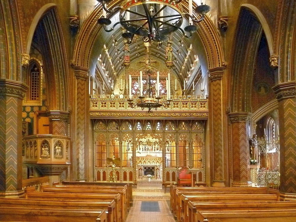
The inside of the digipak has a church theme to it. I had the idea to make this the inside of the album because the centre part of this was originally going to be the album art front cover however due to it having a lot of things going on and not being able to find a font to match it, i decided to make this the inside of the album. I had to find a way to fill the edge of the digipak that will relate to the theme so i crafted an image of chairs to make it fit.
Tuesday, 26 February 2013
Magazine advert - More Ideas
For my magazine advert, I decided to go with the inside of the album (Church). The reason I decided to use this is the bright colours that would attract people to look at it. I thought about how I would set it out, I found that like the digipak I could not add anything to it because of the amount of things going on in the image, the way I would lay it out and still have it effective is to have it like Cee-lo lady killer album digipak where it had the album on the top but at the same time it had a box on the bottom where the writing could go. I thought hard about it and I realised this would be a great idea. I could add the inside of the album but at the same time carry out and follow through with the same theme. I would have a black box at the bottom of the screen with white righting to represent the digipak front and back cover, then have the inside of the album on the top.

Wednesday, 20 February 2013
Editing process so far...
During this editing process, I am finding that I have not edited to the beat on some parts of the song. I noticed that in the song 'Silent Serenade' there was a low bass guitar that I had not noticed before. I noticed this when I cranked up the volume whilst watching my music video and i noticed that it did not fit. In order to make a successful music video, I would have to edit to the beat. to catch it right on the base guitar, I selected the Song on final cut and I locked the clips. Then I played the audio clip and pressed the key, command + (M) every time I hear the base guitar then I would move my clips into position. This was effective because i edited to the beat which made everything mash/come together.


Wednesday, 13 February 2013
Shot List
Shot List
| ||
Scene
|
Shot Number
|
Description
|
1
1 2 2 3 3 4 5 5 |
1
2 1 2 1 2 1 1 2 |
The lead singer Michael holding the microphone and singing
The band members are in action, playing their instrument and the lead singer is singing.
close up of the instruments
Close ups of instruments, Guitars, drums,guitar stick Background shots
Close ups of the band members
Close-ups of the guitarists Ground up shot of guitarist Shots of spotlight
Shot of spotlight reflection on band members.
|
Location sheet
Production Schedule
Location Visit Sheet
Programme Title: Make you a saint Writer: simon Akinwunmi Producer: Sofiyat Kasim Director: Michael Matute Date: 15/12/12 |
Rough Sketch/Explanation of location and key points to note  Access to location via:
Student pass card Name and number of location contact: Robert clack school (Upper site) - |
Health and Safety Issues to note:
|
Potential Filming Problems :
|
| Additional Notes: (map of area/weather forecast etc) Gosfield Rd Dagenham Essex RM8 1JU Since we are filming mostly inside the school, the weather forecast would not be a problem for us. |
Shooting Schedule
Shooting
Schedule
|
Day
|
Scene
|
Location
|
Equipment
|
Costumes
|
Props
|
Cast +Crew
|
|
03/12/12
03/12/12
04/01/2013
04/02/2013
14/02/2013
|
Scenery
The band
members as a whole
Lights
Lead singer
solo by himself
Boy and girl
argument
|
Whaleborn
Lane
Robert clack
(Upper) – Drama room
Robert clack
(Upper) – Drama room
Robert clack
(Upper) – Drama room
Café – Whalebone
lane
House
|
-
Drums,
guitar, microphone & stand
Stage lights
(colours)
Microphone
& Mic-stand
None
|
-
Black
trousers, White shirt, skinny black tie
None
None
Casual
clothing
|
-
-
None
None
None needed
|
-
Michael –
Lead singer, Simon – Drummer. Extra – Band member.
None needed
Michael
Male,
Female.
|
Tuesday, 12 February 2013

Using Photoshop for Digipak - CREATING THE BACK COVER
I started off by opening a new photoshop file 500x500 and pained it black by using the Paint bucket tool.


The next step was to add the text to the album back cover. I selected the text tool then went into the drop down menu as you can see bellow and selected olde English.

I then added the track listings.

In order to make it seem like a legitimate album that could be bought in stores it needed to have a bar code. I searched up a bar code on google and then opened it up on photoshop. I dragged the photo straight onto my album back.


The next step was to add the text to the album back cover. I selected the text tool then went into the drop down menu as you can see bellow and selected olde English.


I realized that i had a problem with the bar code, and that was that it was way too small. So i selected the layer with the bar code then went into Edit > free transformation, which allowed me to move around the bar code.

Bellow stetted out bar code.

Monday, 4 February 2013
Today's Filming
The thing that i want to achieve today is the filming of the band and getting individual shots of each of the band member. We asked for permission to get the instruments and to use the lighting e.g. spot light.
What we changed
What we did was that we mad a couple changes to the band. Instead of me being in the drummer, we decided to use a year 11 as our drummer because he could actually play the drums. We also added another member to our band making him the 2nd base guitarist. We looked at our original shot and it appeared dark it didn't actually show my face so we decided improve our lighting by using spot lights which made a real difference in the film.
What we accomplished in todays filming
Today was an accomplishment. We were able to film more than we had predicted.
Monday, 28 January 2013
Inside of the album (Main)


Contrasted to our album front cover, we decided to make the inside of the Digipak light. We wanted to make this seem like a Bible with the dark colours on the outside and then the light colours on the inside. We though that it would be a good idea because it gives a sense of enlightenment when you look into the Digipak like you do when you look into the Bible. The original image of the digipak had a lot of things going on in the picture. This was originally going to be the front cover of the album however we could not make the title work with it. We attempted 10 times with different methods, so we decided to make this the inside of the digipak.
Monday, 21 January 2013
Digipak - Front Cover (Finished)

Reasons for using the colour scheme is because it is our dress code. It would be useful to have a black background with white writing because it stands out than if it was a white background on black writing. I also wanted it to represent a Bible colour scheme as we are running with the religious theme.
Wednesday, 16 January 2013
Using Photoshop for Digipak - CREATING THE FRONT COVER
The first thing i did was download the different brushes that would be needed in making this front cover.

The next step is opening photoshop and making the background black.


Using the brush tool, i browsed and then selected the cross brush preset that i had uploaded. I then placed the cross in the centre of the background.


The next thing i had to do is add text to this album cover. I used olde english font and wrote on the top and bottom of the cross. (ALBUM TITLE ON TOP, ARTIST ON BOTTOM)


The following steps was to add the band outlines to the cover. Again selecting the paint tool then the selected brush, i placed them in separate parts, creating a new layer for each one.


Tuesday, 1 January 2013
Digipak Ideas
Silent sundays - church theme
Title - Make you a saint
Church with the symbolism to make it seem holy. Due to copyright issues we have to take our own images.
For the title of the album in old english.


Title - Make you a saint
Church with the symbolism to make it seem holy. Due to copyright issues we have to take our own images.
For the title of the album in old english.

I will get the font from http://www.dafont.com/search.php?q=old+english